
Barclays
2007-2009
"We quickly spotted [Ashley's] talent for animation and earmarked him for quick turnaround Barclays projects for which he became the 'go to' designer.
In the early part of my career at Dare, I was integrated into what was known in-house as the 'Barclays Rapid Response Team', dedicated to the client and charged with producing quality work on a quick turnaround. Initially, this was more page and asset design but soon became online advertising, which is what I preferred to do. Over the following years, I created a number of executions, all to exacting brand guidelines and almost inevitably constrained to 30kb.
Working with these constraints enabled me to learn the finer points of Flash optimisation, and often required me to create my own illustrations instead of using stock photography assets, even just to shave off a kilobyte here or there.
As I became more experienced within the agency, my role grew to encompass an unofficial creative brand guardianship of sorts. I used to be able to reel off the hex codes of the two different blues that Barclays incorporated in its branding. Thankfully, I can no longer recall such nerdy details. But this experience in Barclays online advertising solutions meant I was a the ideal candidate to help shape a new aesthetic for their advertising moving forward.
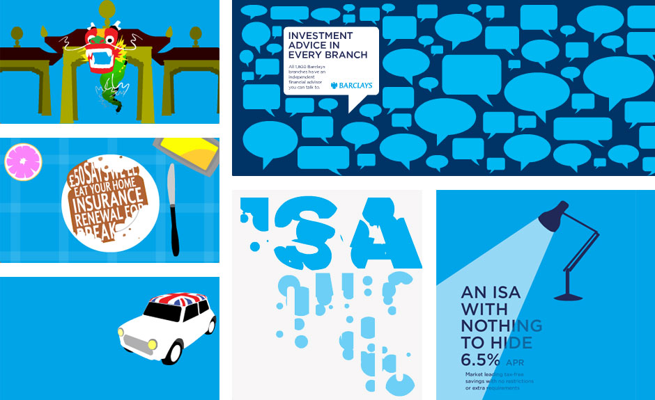
The result was a flattening of the palette, and the use of more abstract iconography and illustration where once the emphasis was placed on 'realistic' illustration - all gradients and drop shadows. The re-brand was known in-house as 'Project Charlie' and there are executions on this page - for both online banners and in-store screen concepts - which incorporated the change of direction.
The first creative to utilise the 'Project Charlie' aesthetic revolved around savings accounts and were split across three executions - 'Neat Things', 'Brit Design' and 'Asia'. They were typographically led, incorporated simple interaction (rare for Barclays executions) and used bespoke illustration that was much more abstract than the styles that had come before.
'Breakfast' followed closely behind, again incorporating strong typography and flat illustration. This one was based on the "theme" of being on a table (complete with abstracted tablecloth) and the execution used the idea of a "camera" that swept over the different copy frames before reaching the end frame.
Further down, I've included examples of animations that were to be used in a high-concept Barclays branch of the future, all white glass and cyan touch-screens. These executions were much more pared down than their online counterparts, relying on eye-catching animations and pithy messages to convey their purpose across quickly and succinctly.