


Riot Games
2013
"...the site went really well, and everyone was super happy with it..."
Riot Games approached me to design a microsite that would aggregate all the content from their presence at Gamescom 2013 in Cologne, based on their huge MOBA game League Of Legends. Throughout the weekend, Riot's content creators would be generating blog posts, videos, photos and competitions, as well as keeping an up-to-date live schedule of all events from their stage, and a responsive portal that could collate all those disparate elements was needed - one which could be viewed as comfortably on an attendee's device at Gamescom itself as on a desktop at home.
Paired with a developer, I went to work creating a modular system of panels for the homepage that could comfortably house all types of content at a glance, with a lightbox-style overlay that revealed the full content when a panel was clicked. I was also instructed to retain elements of the look-and-feel of the main League Of Legends website, whilst still keeping the design functional, so that its performance would not be bogged down by unnecessary fantasy embellishments.
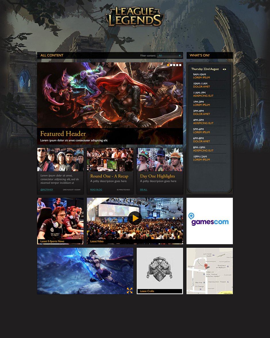
After initially trying to incorporate a modular system underneath a fixed header/carousel and schedule combination, it quickly became clear that a more flexible approach would be needed, and I experimented with a number of ways in which a multi-column grid layout could be used, and how big each content 'cell' would be if the microsite was viewed at its maximum width. However, it soon became apparent that a number of more important content cells would need to remain at the top of the page at all times, which soon became known as 'stickies'. These stickies involved the key logos of game and publisher, important information about the conference itself, and a dynamic schedule calendar. Underneath this, a more fluid grid was developed that could be sorted and filtered on content if required.
With the development timings on the tight side, I clearly deconstructed all the elements of my designs for both homepage cells and lightbox designs so that the developer could see at a glance how it was all supposed to hang together, including width percentages on the max width of the design so that the site could be built responsively. I also produced mockups on how I envisaged the design to work across tablets and smartphones in order to help the developer decide how to build his media queries.
Despite the timescales involved, the work ended up being exhaustive and meticulous, and I'm pleased with how crisp and clean this practical, modular design ended up, whilst still retaining the brand aesthetics of the League Of Legends fantasy setting.

Early designs based on a more 'traditional' website layout.


Two modular grid designs of varying column numbers.

Final presentation of homepage cells, with 'sticky' content on the top.

A mockup on how the content flow might change on a tablet.


Examples of the level of detail for different sizes of content 'cell'.

Similar to those above, this template explains the details of the schedule lightbox.